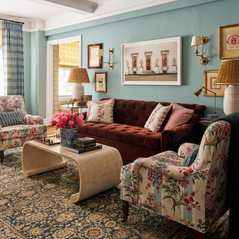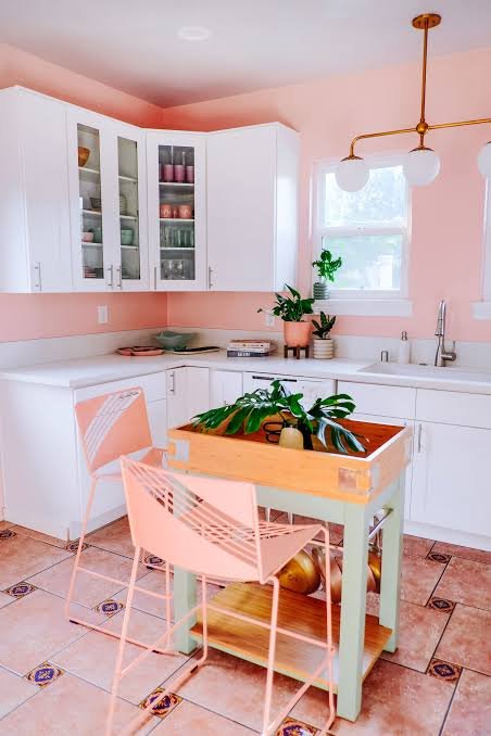
So you’re standing in front of a paint shop wall covered in 200 tiny swatches, and none of them look anything like they did in your head. Sound familiar? Learning how to choose paint color for room decisions isn’t about picking your favorite shade off a chart — it’s about understanding light, space, and what a room is actually for. I’ve repainted enough rooms (and made enough mistakes) to know the difference between a color that looks good on paper and one that actually works on your walls.
In this guide, I’ll walk you through exactly how to choose paint color for room after room, without wasting a single tin of paint. No fluff, just what’s actually worked for me and for clients I’ve helped over the years.
Why Choosing the Right Paint Color for a Room Actually Matters
Choosing paint color for room decisions affects more than looks — it shapes mood, perceived space, and how long you’ll actually love the room. A wrong choice costs you time, money, and the annoyance of repainting within a year.
Here’s the thing nobody tells you: paint isn’t just decoration. It changes how big or small a room feels. It can make a north-facing bedroom feel cold even in Jaipur’s summer, or make a tiny study feel like a cave if you go too dark without a plan. I’ve seen homeowners repaint the same room three times in a year because they picked colors based on a friend’s living room or a Pinterest board that had zero relation to their actual light conditions.
Get it right the first time and you save yourself real money — a decent 1BHK repaint in most Indian cities runs anywhere from ₹15,000 to ₹40,000 depending on the finish and area. That’s not pocket change to redo because the color felt “off” after a week.
Understand the Room’s Natural Light First
Direct answer: Rooms facing north get cooler, softer light and suit warm paint tones. South and west-facing rooms get strong, warm light and can handle cooler blues or greens without feeling cold. Always test paint in the room at different times of day before committing.
Light changes everything. A soft beige that looks warm and cozy in a shop’s fluorescent lighting can turn oddly yellow or grey once it hits your actual walls at 4 PM.
Before you even start comparing shades, spend a day just watching the room. Morning light versus afternoon light versus that evening glow from your tube light — they all shift how a color reads. I always tell people: don’t trust the swatch, trust the wall.
A few things I’ve noticed:
- East-facing rooms get warm morning light but can look flat and grey by evening
- West-facing rooms often run warm and golden in the afternoon — great for cooler paint tones
- Rooms with minimal natural light (think inner bathrooms or store rooms) need lighter shades or they’ll feel boxed in, even if you like moody colors elsewhere
Test Samples Before You Commit
Buy sample pots. Seriously, don’t skip this. It’s the single biggest thing that separates a good paint job from a “why did I pick this” regret.
Paint a patch at least 2 feet by 2 feet on two different walls — one that gets direct light and one that doesn’t. Look at it in the morning, afternoon, and under your actual bulbs at night. LED lights and warm incandescent bulbs can make the exact same color look like two completely different paints.
I once helped a friend pick a “soft grey” for her living room in Malviya Nagar. It looked perfect on the sample card. On the wall, under her yellow-toned tube lights, it read almost lavender. She ended up loving it, actually — but only because she tested first instead of painting the whole room and hoping for the best.
How to Choose Paint Color for Each Room Based on Its Purpose
Direct answer: Bedrooms work best with calming, muted tones like soft blues or warm neutrals. Kitchens and dining areas do well with energizing colors — yellows, warm whites, or soft greens. Living rooms are flexible but should reflect how the space is actually used, not just trends.
Different rooms serve different purposes, so treating every wall the same is where a lot of people go wrong.
Bedrooms
This is where you sleep, unwind, maybe scroll your phone longer than you should. Go for calming shades — dusty blues, soft sage, warm greys, muted terracottas. Avoid anything too bright or saturated; it can keep your mind more “on” than you want at bedtime.
Living Rooms
This room usually gets the most footfall and the most light exposure over a day, so it can handle a bit more personality. Warm neutrals, soft olive, even a deeper accent wall in navy or forest green can work beautifully if the room gets decent natural light.
Kitchens
Kitchens benefit from colors that feel clean and energizing. Soft yellows, warm whites, or even a muted teal on cabinets can lift the whole space. Avoid very dark, matte colors near cooking areas — they show grease and stains faster than you’d think.
Bathrooms
Small bathrooms, especially windowless ones, do best in lighter tones — pale blues, soft greens, or off-whites. A glossy or semi-gloss finish also helps bounce whatever light you do have around the room.
Use the 60-30-10 Rule for Balance
This old interior design rule is genuinely useful when you’re trying to choose paint color for room schemes that don’t feel chaotic.
Here’s how it breaks down:
- 60% — your dominant color, usually walls
- 30% — secondary color, could be furniture, curtains, or an accent wall
- 10% — an accent color for smaller details like cushions, artwork, or a single statement piece
Picture a small business owner in Jaipur turning her spare room into a home office. She picked a warm sand tone for 60% of the walls, added a deep teal accent wall for the 30%, and used mustard yellow cushions and a lamp for that final 10%. The result felt intentional instead of random — and it cost her almost nothing extra, since she was just being smart about where colors went.
Don’t Ignore the Finish, Not Just the Color
Choosing paint color for room walls isn’t only about the shade — the finish matters just as much, and this is where a lot of people trip up.
- Matte/flat: Hides wall imperfections well, but shows marks and stains more easily. Good for bedrooms and low-traffic areas.
- Eggshell: A nice middle ground — slight sheen, decent durability. Works well in living rooms and hallways.
- Satin: More washable, holds up in kitchens and kids’ rooms.
- Semi-gloss/gloss: Best for trims, doors, and bathrooms where moisture and wipeability matter more than a soft look.
I’ll be honest — I used to think finish was a minor detail. Then I painted a hallway in flat matte and within two months the scuff marks near the switchboard were impossible to clean off without leaving a patch. Lesson learned.
Small Rooms vs Large Rooms: Different Rules Apply
Small spaces don’t always need light colors — that’s actually a myth I’d push back on a little. A small room painted in a deep, saturated color with good lighting can feel cozy and deliberate rather than cramped, especially if the trim and ceiling stay lighter to keep some contrast.
Large, open rooms have more flexibility. You can go bold on one wall without overwhelming the space, or use a single unifying color across an open-plan living-dining area to make it feel connected rather than choppy.
One thing that does hold up: ceilings almost always look better a shade or two lighter than the walls. It keeps the room from feeling like it’s closing in on you.
How to Coordinate Paint Colors Across Connected Rooms
If your home has an open layout, or rooms that flow into each other, jumping between wildly different colors from room to room can feel disjointed. Pick a base neutral that runs through connected spaces — hallways, open kitchens, living areas — and let individual rooms introduce their own accent from there.
[link to related guide about open-plan home color schemes here]
This doesn’t mean everything needs to match. It just means there should be some logic connecting one space to the next, so walking from your living room into your kitchen doesn’t feel like stepping into an entirely different house.
Common Mistakes People Make When Picking Paint Colors
- Choosing a color purely from a tiny swatch card without testing it on the wall
- Ignoring the room’s lighting direction completely
- Going too trendy — some colors look great in 2026 catalogues but date fast
- Forgetting to check how the color looks next to existing furniture and flooring
- Painting an entire room before testing a sample patch first
[link to related guide about paint finishes and durability here]
Has this happened to you — repainting a room within a year because the color just never felt right? You’re definitely not the only one.
FAQ: Choosing Paint Color for a Room
Q: How do I choose a paint color for a room with little natural light? Stick to lighter, warmer tones — soft creams, pale yellows, or light greys with warm undertones. Avoid cool blues or dark shades, since they can make an already dim room feel flatter and smaller than it is.
Q: What’s the best paint color for a small room to make it look bigger? Light neutrals with a hint of warmth generally work best, though a saturated color with a lighter ceiling can also create a cozy, intentional look rather than a cramped one. It really depends on the mood you’re going for.
Q: Should ceiling color match wall color? Not usually. A ceiling a couple of shades lighter than the walls, or a clean white, tends to keep the room feeling open and gives a nice visual break.
Q: How many paint samples should I test before deciding? Three to four is usually enough. Testing more than that just gets confusing and you’ll end up second-guessing yourself.
Q: What paint finish is best for a kitchen? Satin or semi-gloss, since kitchens deal with grease, steam, and constant wiping down. Flat matte tends to stain and show marks faster in high-use areas like this.
Q: Do dark paint colors make a room feel smaller? Not always — it depends on lighting and how the color is balanced with trim, furniture, and ceiling. A well-lit room with good contrast can carry a dark wall color beautifully.
[link to related guide about accent wall ideas here]
Final Thoughts
Picking the right paint color really comes down to patience — testing samples, watching how light moves through the room, and thinking about what the space is actually for, not just what looks nice on Pinterest. Skip the shortcuts, and you’ll save yourself a repaint down the line.
If you’re about to start your next room, grab two or three sample pots before buying a single full tin. Paint those patches, live with them for a few days, and then decide. Your future self — and your wallet — will thank you.